

Birdfeed: Birdwatching Mobile App

solution
Recognizing the growing need that accompanies a growing interest in birdwatching, I created Birdfeed, an app that aims to be the source people turn to for any information related to wild birds, including identifying birds. My process to create this high-fidelity prototype included:
Secondary research
User screener survey
Identifying red routes for the app
Paper sketches
Guerilla usability testing
Wireframes
Two rounds of high-fidelity usability testing
Problem
Birdwatching and feeding wild birds have become more popular in recent years, especially during the COVID-19 pandemic lockdowns. When new people gain interest in birdwatching, it can be difficult to learn everything they need to get started. They may struggle to identify bird species and face frustration when new birdfeeders do not attract birds.
Secondary Research
The objective of secondary research was to determine the needs, challenges, and motivations of people who feed birds.
Notable findings
Multiple studies show the primary motivating factor for feeding birds to be the psychological benefits that people gain. People may derive a sense of pleasure or relaxation from feeding birds. Research findings also suggest that people derive well-being from taking on a protective role of the birds they feed.
Seeing different and new species of birds commonly drives people to feed birds.
One surprising facet discovered was an exploratory study of adults ages 18 to 50 that one common motivation for feeding birds is to share bird experiences with social media networks.
User Interviews
I conducted user interviews with 5 people over Zoom who have been feeding birds at their homes from one to 40 years.
Notable findings
Although three of the participants have used apps to identify birds, this is generally not their preferred method, as they cited dissatisfaction with the speed and lack of trust in the accuracy of birdwatching apps.
Identifying birds, with or without apps, can be a challenge for both experienced birdwatchers and beginners.
More experienced birdwatchers may be familiar with most common local species but still need resources to help with identification while traveling.
Birdwatchers of all experience levels expressed an interest in learning more about birds.
QUOTES FROM USER INTERVIEWS
On finding information:
“All these categories of information I feel like are in disparate locations on the web. Like there's some websites that are really good about feeding, but they're all about feeding. Or there's some websites that are really good about being able to identify with noises but it's just like a list of noises and there's no one consolidated place.”
On using an app to identify birds:
“I guess it thinks it's helpful, because it wants you to look up what kind of a shape it was or color it was. But I can be like, well, it wasn't just brown, it was brown and white with some speckles or something. It's hard to narrow down in their categories. And you just wonder if you're getting the right thing.”


emphathize

Empathy Map
Birdwatching can be a source of joy for a variety of individuals. Birdwatchers spend a lot of time reading about birds. There is a need for an easier-to-use, more comprehensive source of information. Something else I learned from user interviews was that sharing photos of birds on social media helped them to build connections.

Personas
From the user interviews, I developed two personas to keep in mind while developing the Birdfeed app: the Beginner and the Experienced birdwatcher. The Beginner birdwatcher is just starting out with birdwatching and may have limited knowledge of the local species around him. He needs an easy, reliable way to identify birds. The Experienced birdwatcher has needs beyond the basics. She is familiar with the common birds in her area but needs a resource to help with identification while traveling. This type of user will also make an effort to see rare birds spotted in her area, so timely information is important.


Sketches
Armed with the knowledge from my user interviews, I sketched out the first versions of the app. From user interviews, it was clear that the most common task birdwatchers want to be able to do easily is identify birds, so I set out to develop a user-friendly process to identify birds.
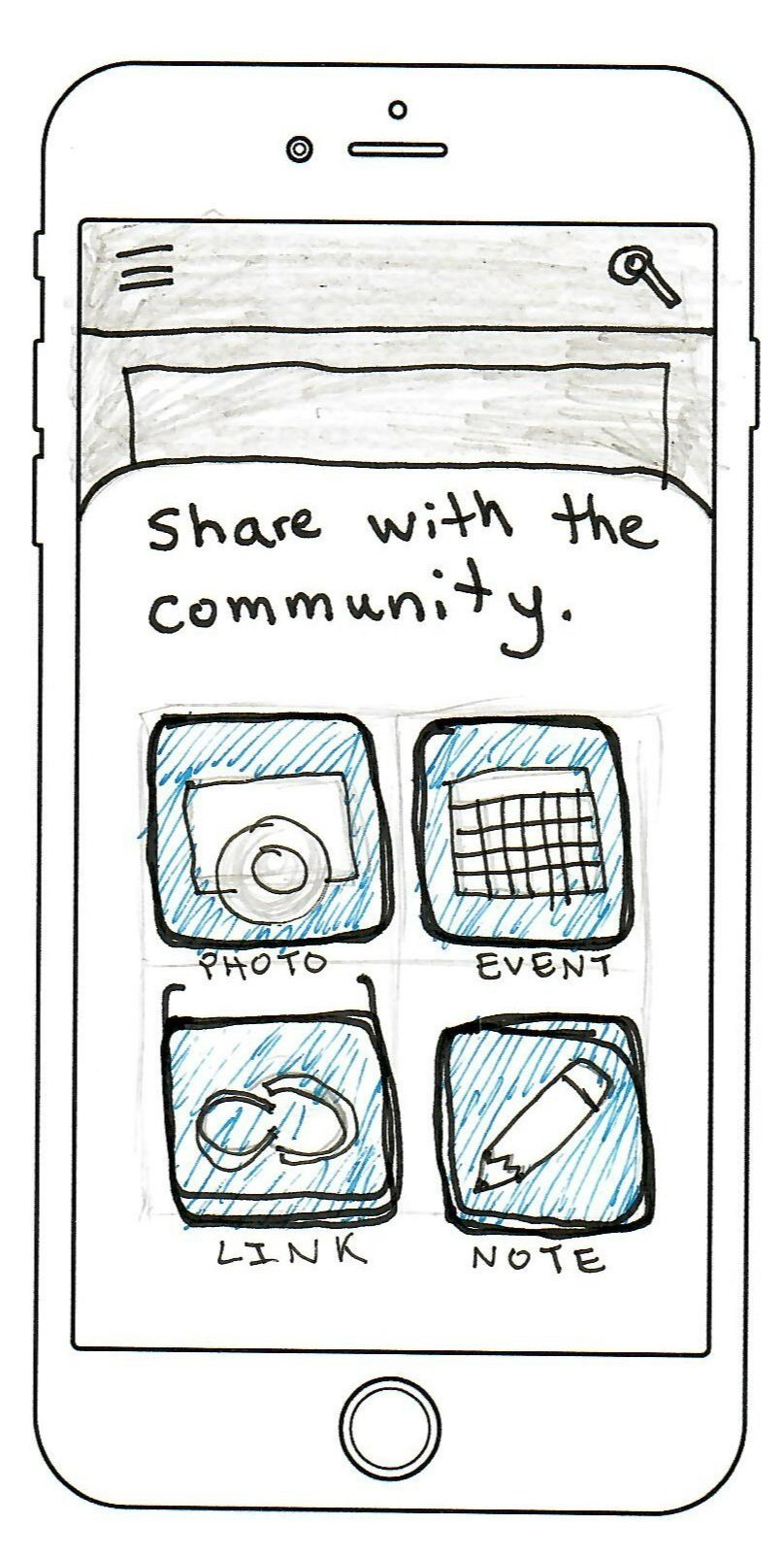
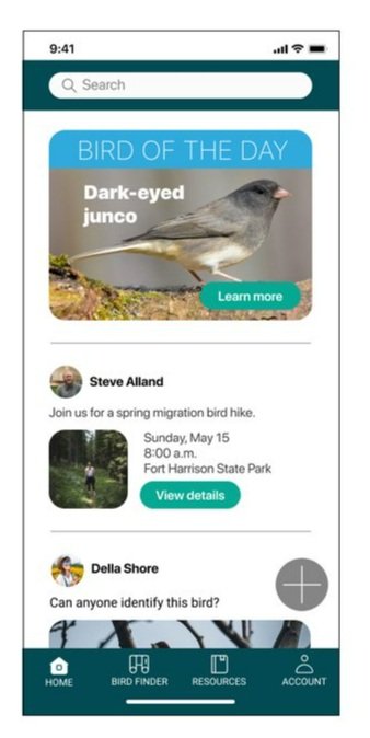
And after hearing that birdwatching was a means to connect with others, I knew it would be important to build a social element into the app. I created a news feed on the home screen to show updates when users open the app. This makes the app more dynamic, encouraging users to use it daily. Users can share photos, events, links, and notes with the community.
Guerilla Usability Testing
Guerilla usability testing with five users revealed the app was usable but needed improvements in consistency and clarity. The most confusing part of the app seemed to be where to go to identify a bird. Two different people clicked on the search icon first. After navigating to the Bird ID screen, it took some users a while to decide which of the options to select next. One user was so confused that they went back to the home screen to see if there was a better option to select and then tried clicking the share button.

Wireframes
In the wireframes for the app, I refined and modified designs from the sketches for better usability. I changed the name of the Bird ID section to Bird Finder.
I also added walkthrough modals highlighting different aspects of the home screen for new users. These walkthroughts highlight different parts of the app depending on whether the users identify their level of experience as “just getting started” or more advanced. I also created a modal that will appear the first time users tap on the bird finder screen, highlighting the ability to search for a bird based on its features.

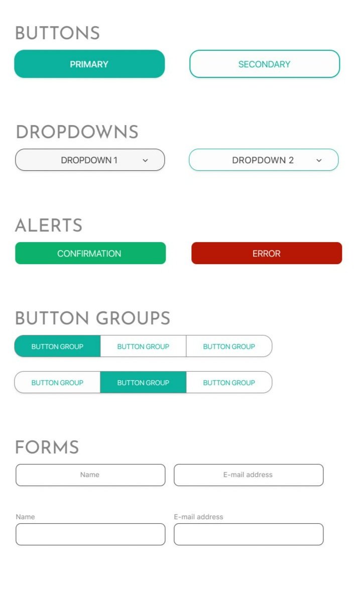
Style Guide
Birdfeed brings together flocks of humans to level up their bird knowledge through education and connection. The brand personality I wanted to convey for Birdfeed is a friendly, approachable well of information that dispenses knowledge in an engaging and accessible way. People should be able to learn from the app, but I don’t want it to be boring or stuffy. Brand attributes are expert, welcoming, helpful, and dynamic.
I chose bright, natural colors to represent the brand. For the Birdfeed logo, I created an abstract form based on two overlapping seeds that is also reminiscent of an open bird beak, evoking ideas of nature and conversation.


Colors
Fonts
icons
User interface
high fidelity designs


onboarding flow
home
walkthrough - beginner
walkthrough - advanced


resources
account
bird finder flow
usability testing
I conducted moderated remote usability testing with five different participants over Zoom. The purpose of usability testing was to identify any parts of the UI that cause confusion.
issues identified
Participants had difficulty returning to the home screen after reaching the end of the bird finder flow.
The design of the icons for more information (question marks) on the Body Shape screen needed improvement.
The “share photo” screen lacks a way to modify photos, such as cropping the photo or adding the location where it was taken.

solutions implemented
I increased visibility of the X for the second round of testing and changed the screen to which the X navigates from the main Bird Finder page to Home.
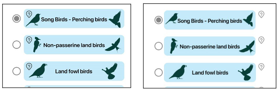

I separated the icons from the other information and increased their size for improved clarity and usability.
I added an “edit” button to the interface, which would bring up additional options for editing the photo prior to sharing.
SECOND ROUND OF HIGH-FIDELITY TESTING
I conducted my second round of testing with five participants, once again fully remote and moderated. This second round of testing did not uncover any major issues. Most feedback from the participants centered around details of the UI rather than usability issues. Comments included certain elements not looking perfectly centered, type size on certain elements being too small, and text being too close to icons.
One minor issue is that some participants looked first under “Resources” for their list of saved birds. It could be beneficial to add the user’s list of saved birds under the “Browse Bird Species” section of “Resources,” a page that was not created prior to user testing. The other red routes and elements users tested seemed to be user-friendly.
Final Thoughts
Creating a product for a niche audience had its challenges. I faced difficulty finding relevant secondary research as well as recruiting research participants. However, I found it easier to focus on a problem that didn’t already have a variety of quality apps offering solutions.
Through this process I learned how difficult it can be to balance what users want with what is possible within technical and time restraints. Some of the elements I identified from user research as being important to include, such as interactive bird migration maps, were ultimately not part of the prototype.
Overall, the final product serves the needs of its users. I would like to revisit this project and mockup other screens in the future.


